Fast Forward is a San Francisco-based tech nonprofit accelerator supporting tech for good. We created an identity that embodies their bright, optimistic energy.
NOVEMBER 2024
VISUAL IDENTITY, WEB, ILLUSTRATION, CREATIVE DIRECTION
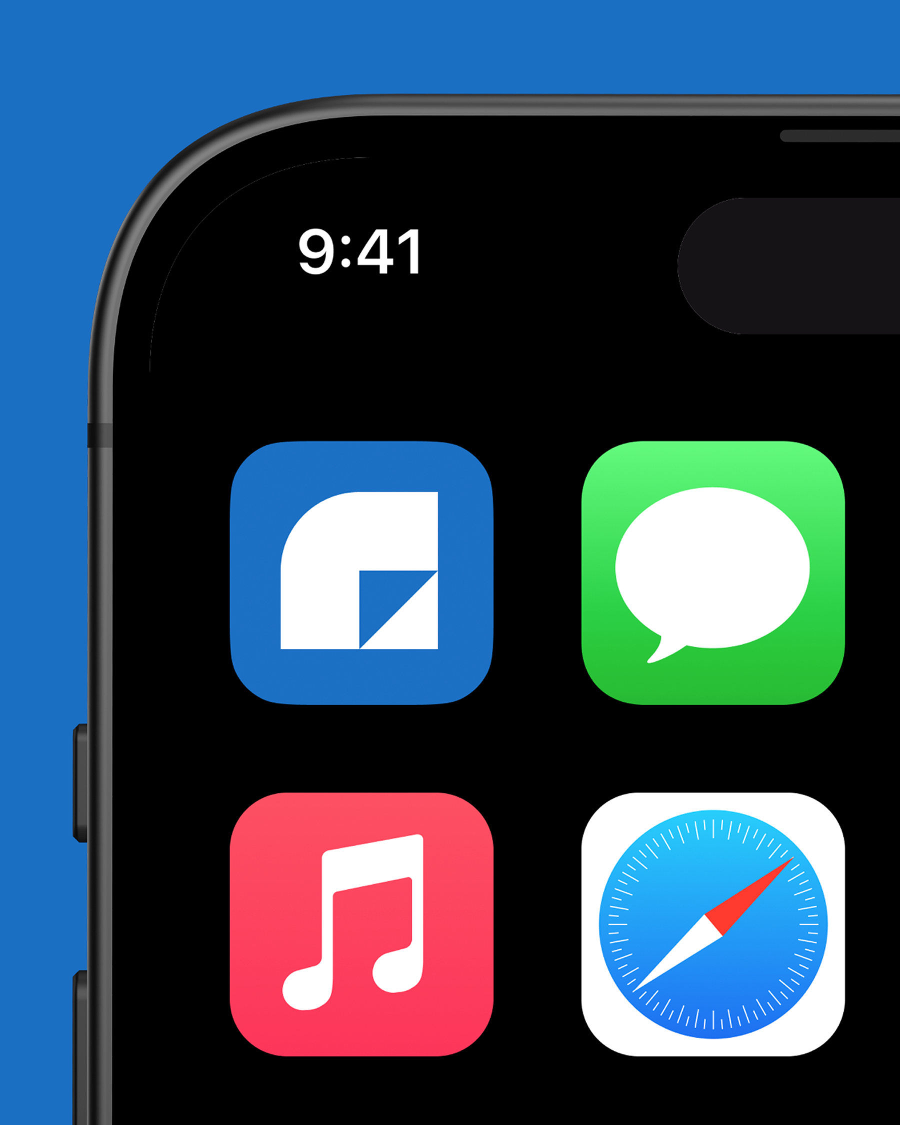
Fast Forward’s brand is all about connections—the ones they build between partners, founders, and those impacted by their work. We designed a logo system that reflects this idea through subtle, custom ligatures and a scalable system that adapts effortlessly for different uses.
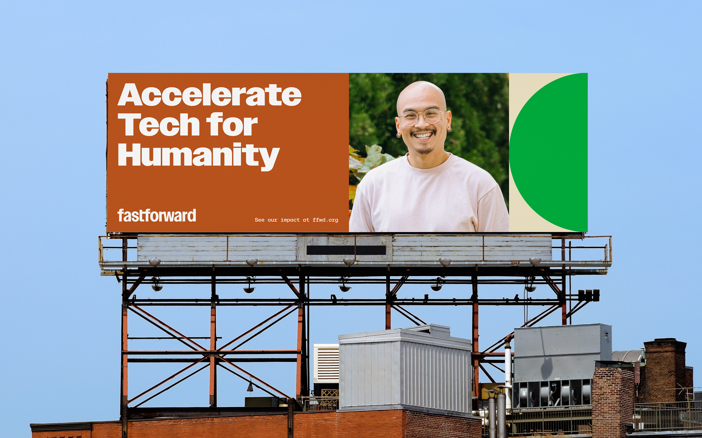


Fast Forward’s color palette is bright, optimistic, and versatile—reflecting the wide range of industries they work in, from healthcare and education to climate, human rights, and mental health. The colors feel human while maintaining a refined quality, allowing them to be used as a vibrant, expressive tapestry or a clear, structured coding system when needed.
"Two Are took us from a magical mess of post-its and Pinterest boards to an elegant, powerful brand. They were sharp and communicative partners each step of the way."
Nicole Dunn
VP of Marketing & Communications, Fast Forward
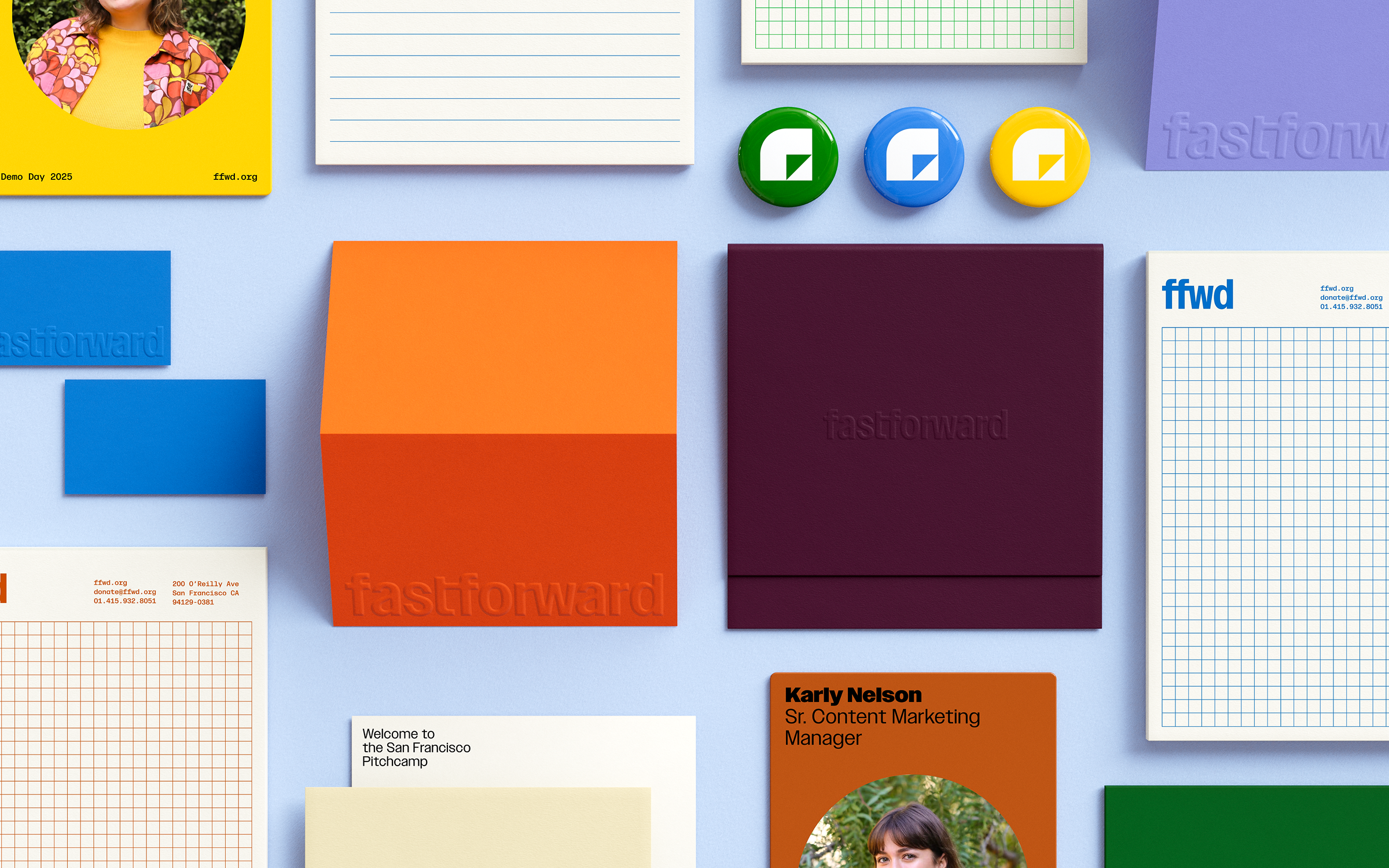

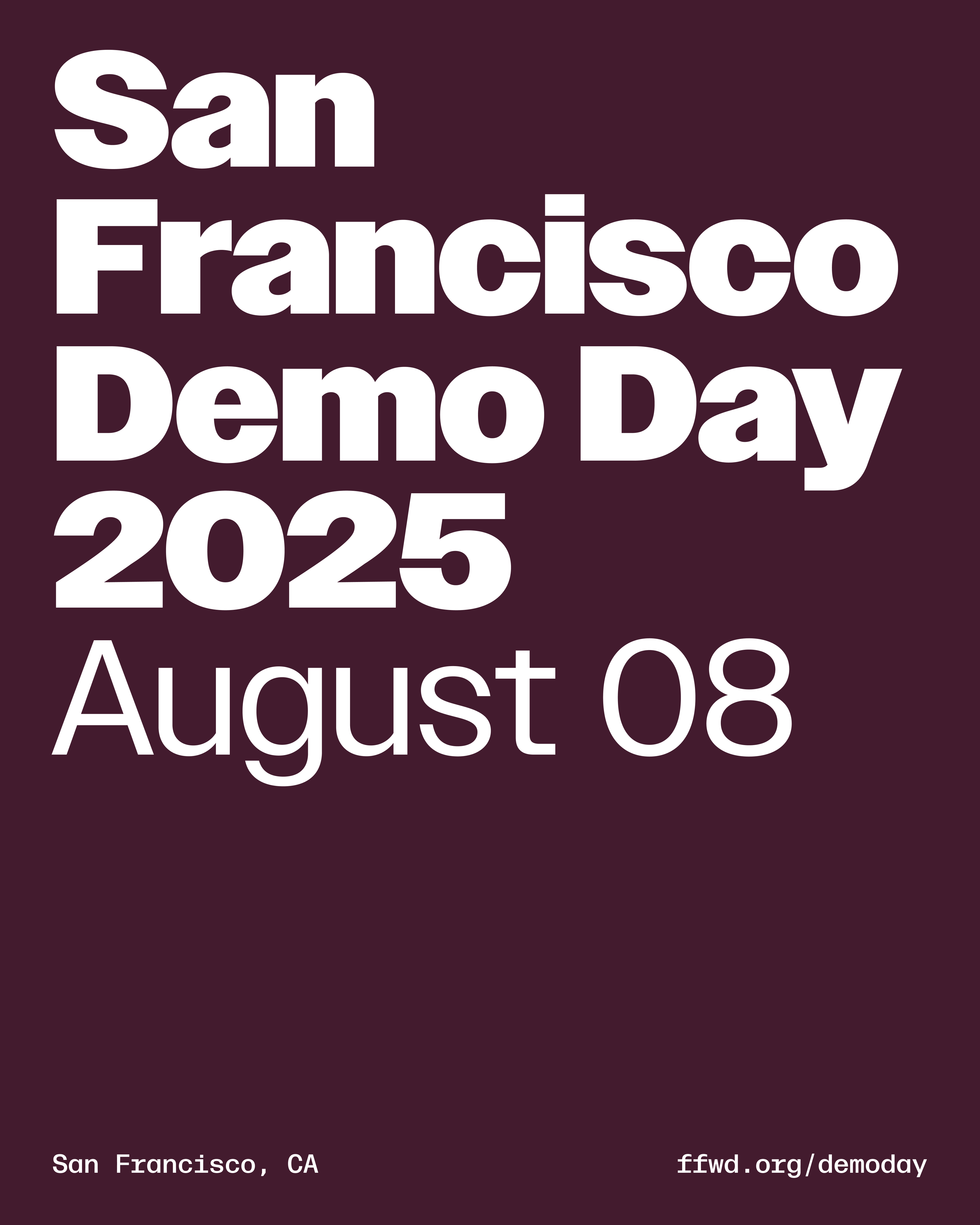
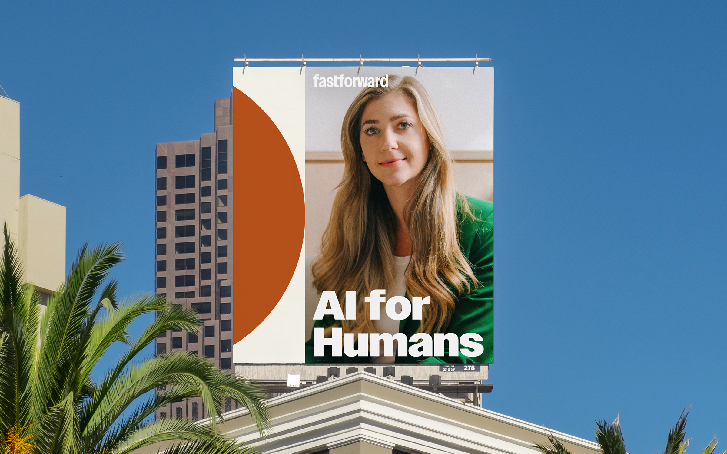
Building on the theme of connections, we developed a dynamic graphic language that incorporates shapes, textures, and imagery to visualize this concept. These elements can serve as patterns or as containers for information, depending on the need.
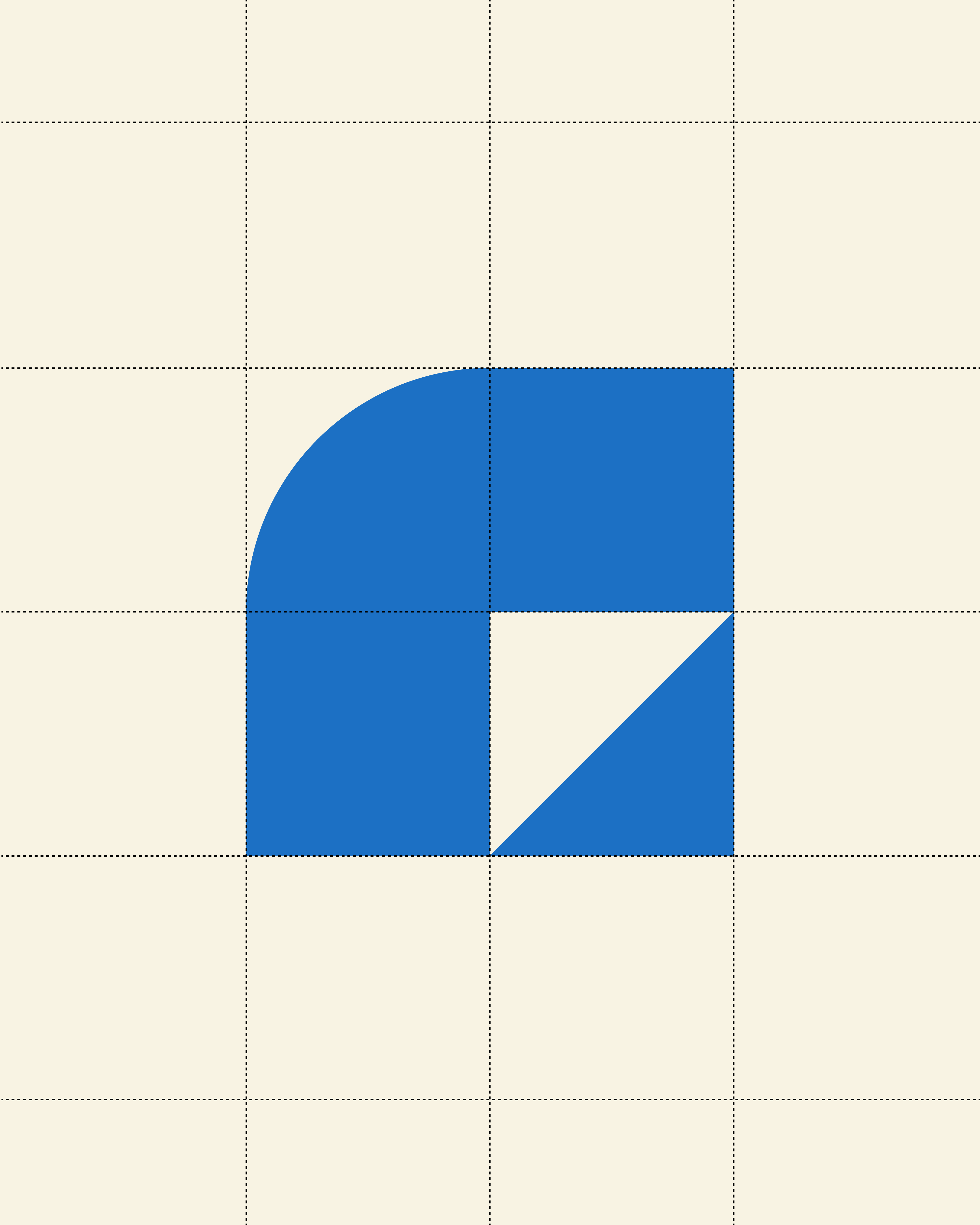
At the core of this system are the 5 Connective Shapes. Whether they appear as a continuous line or are cropped to create a more dynamic layout, they are designed to seamlessly connect with one another. These shapes serve as the foundation for the visual language, allowing for flexibility and consistency across various applications.
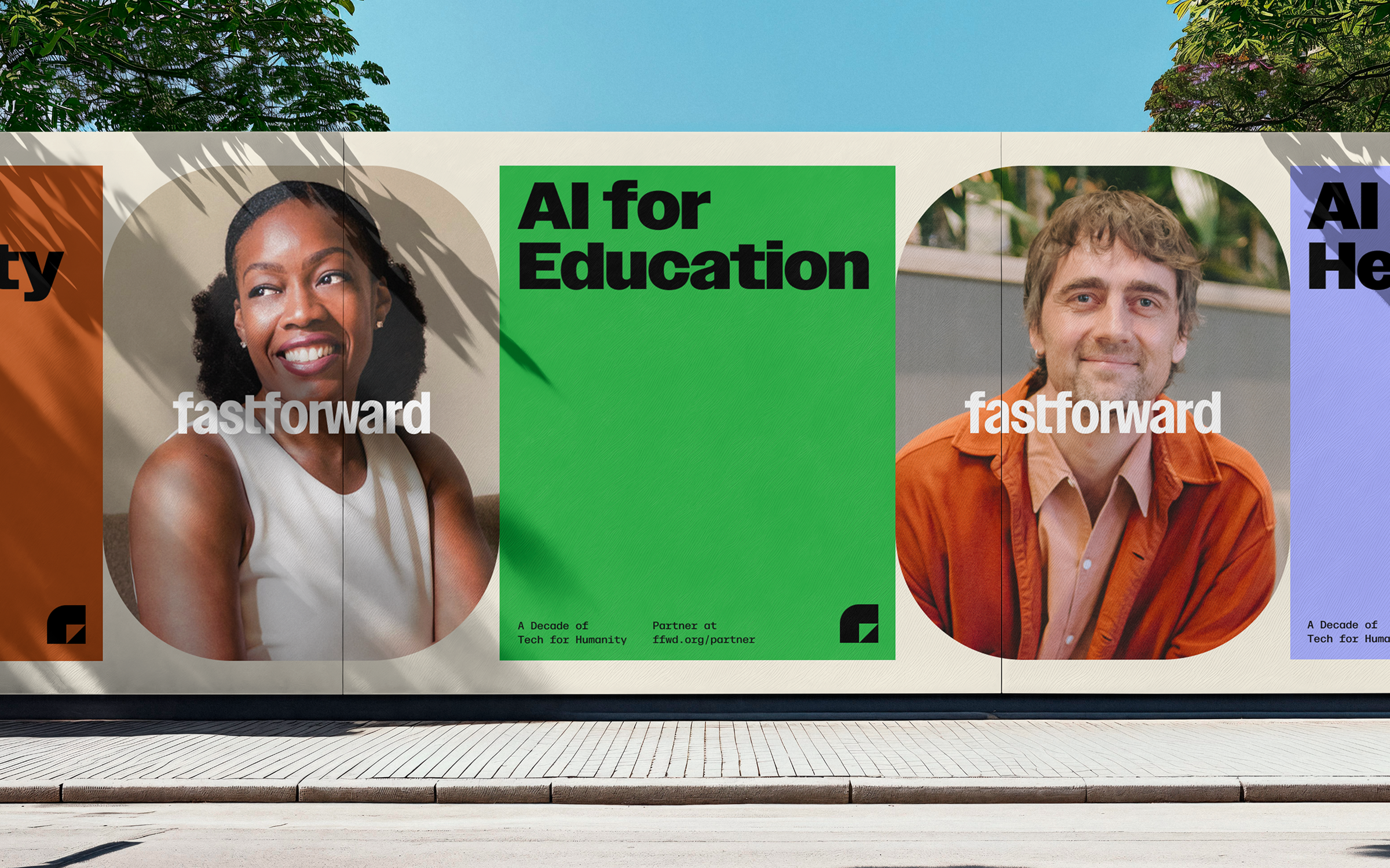


We used a combination of clean lines and bold textures to add a dynamic quality to the brand that reflected Fast Forward's work.


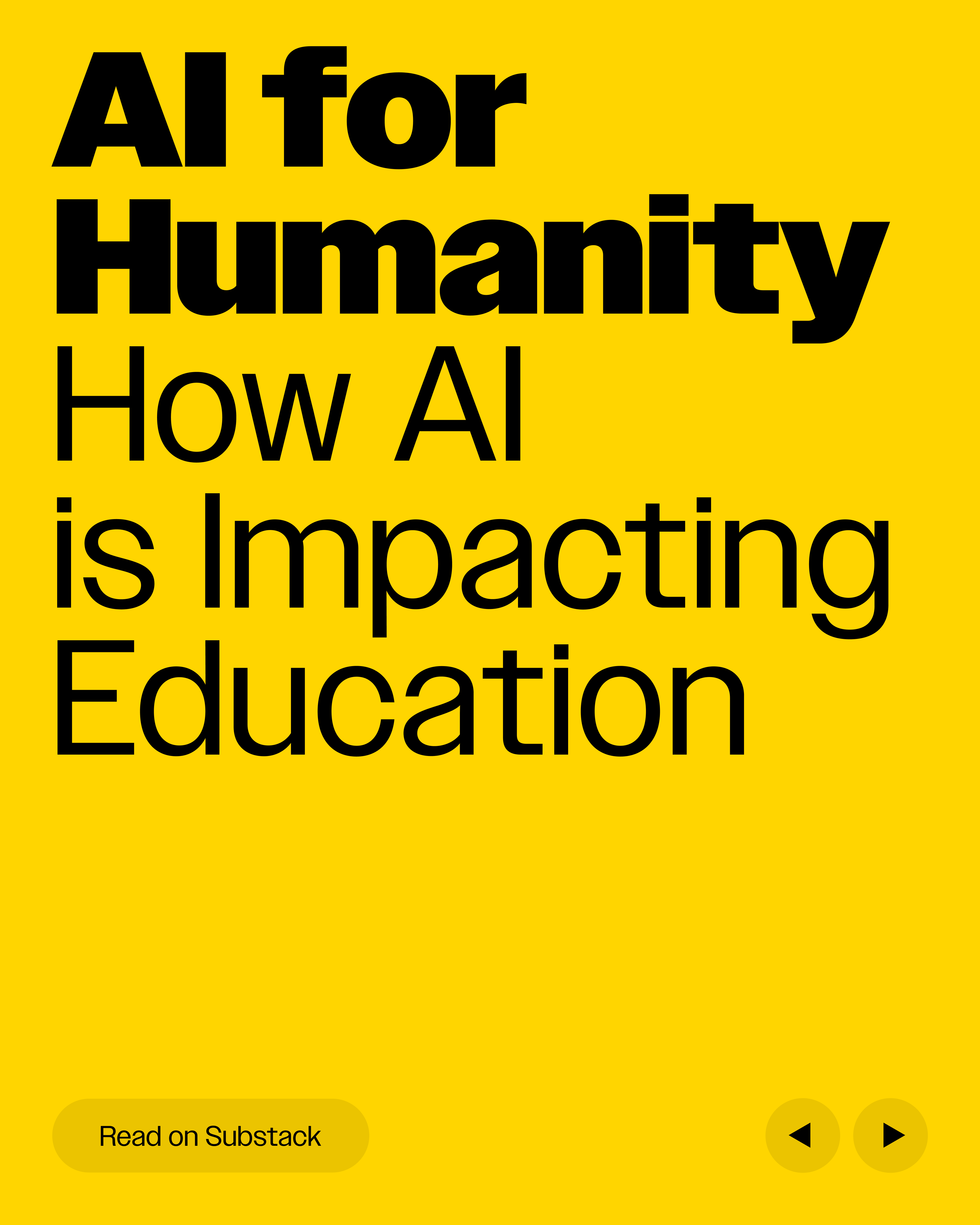
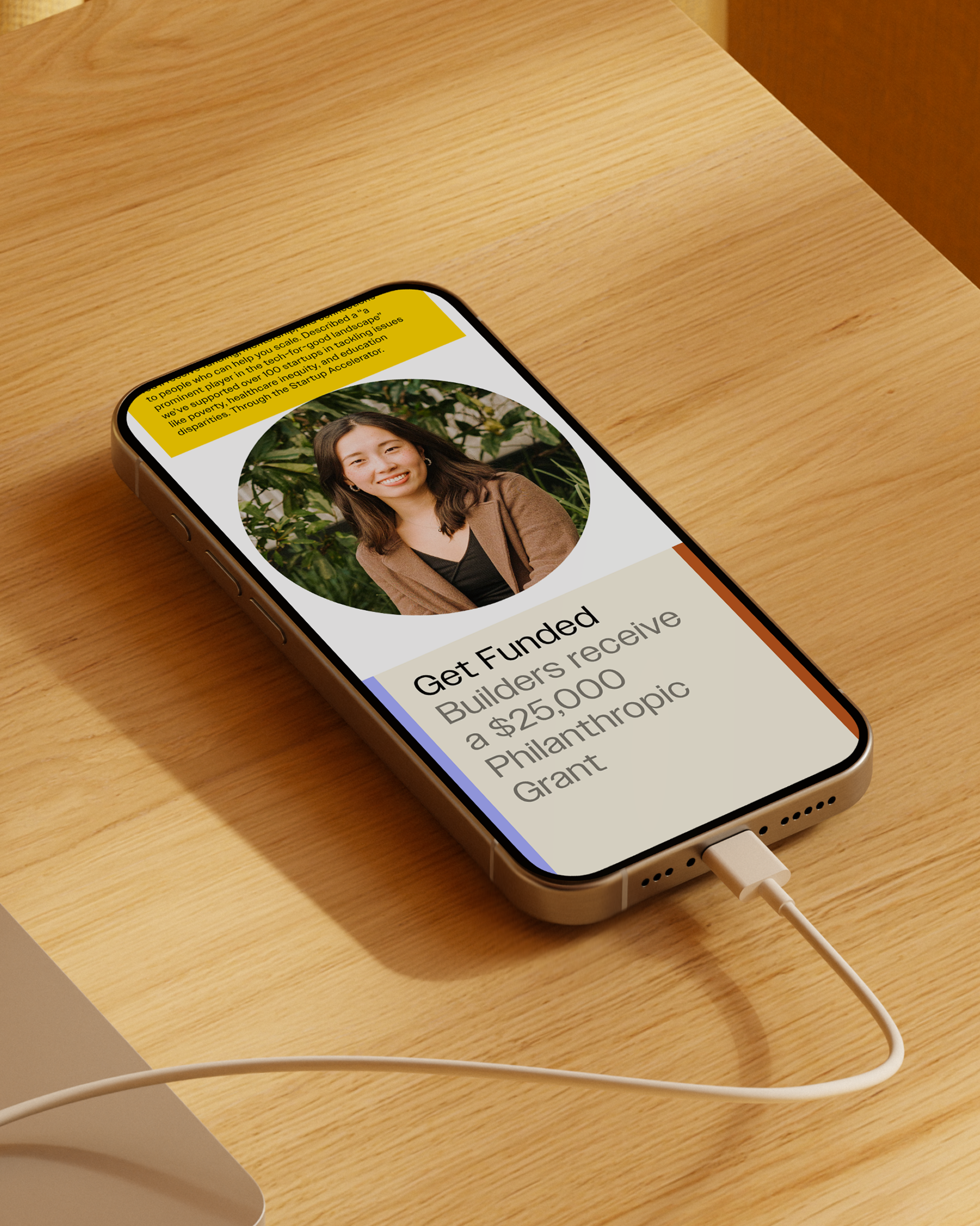
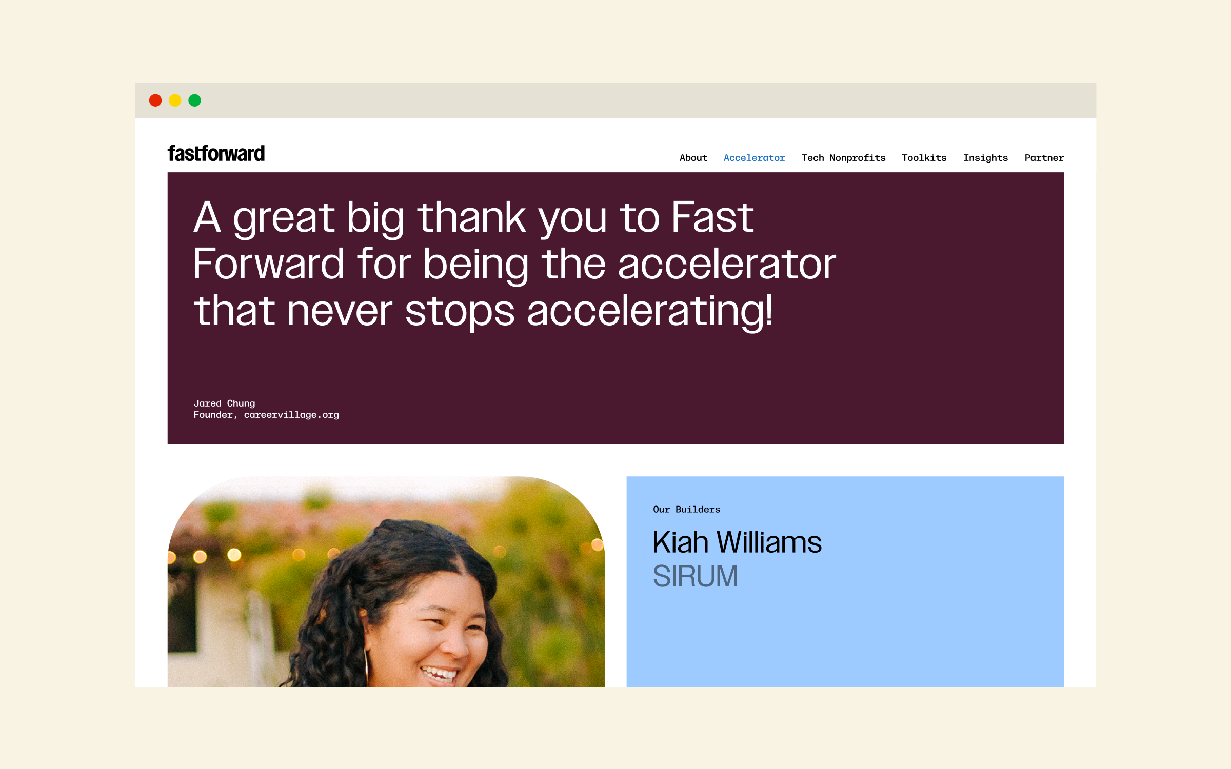
Fast Forward is a San Francisco-based tech nonprofit accelerator that supports and invests in organizations using technology for social good. They partner with leading organizations like Google.org, The Ballmer Group, Bloomberg, and OpenAI to amplify their impact. After a decade of impactful work, the Fast Forward team had grown into a leader in the Tech Nonprofit space. We collaborated closely with them to develop a brand positioning, visual identity, and website that capture their bright, optimistic energy while maintaining the flexibility to evolve as they continue to grow. Fast Forward’s core mission is to bridge gaps for nonprofits by providing the operational infrastructure they often lack. While these nonprofits have issue area expertise, they often need the operational support to turn their vision into lasting impact. To reflect this, we built an identity centered around the idea of connection. Through a vibrant color palette, founder portraits, and dynamic shape layouts, we positioned Fast Forward as a forward-thinking leader in their field, ready for the next decade(s) of impact.
Creative Direction/Design
Briana Garza
Caleb Van Dyke
Web Design/Development
Tyler McRobert
Photography
Michelle Nguyen
Fast Forward Team
Nicole Dunn
Karly Nelson
Kevin Barenblat
Shannon Farley
Typefaces
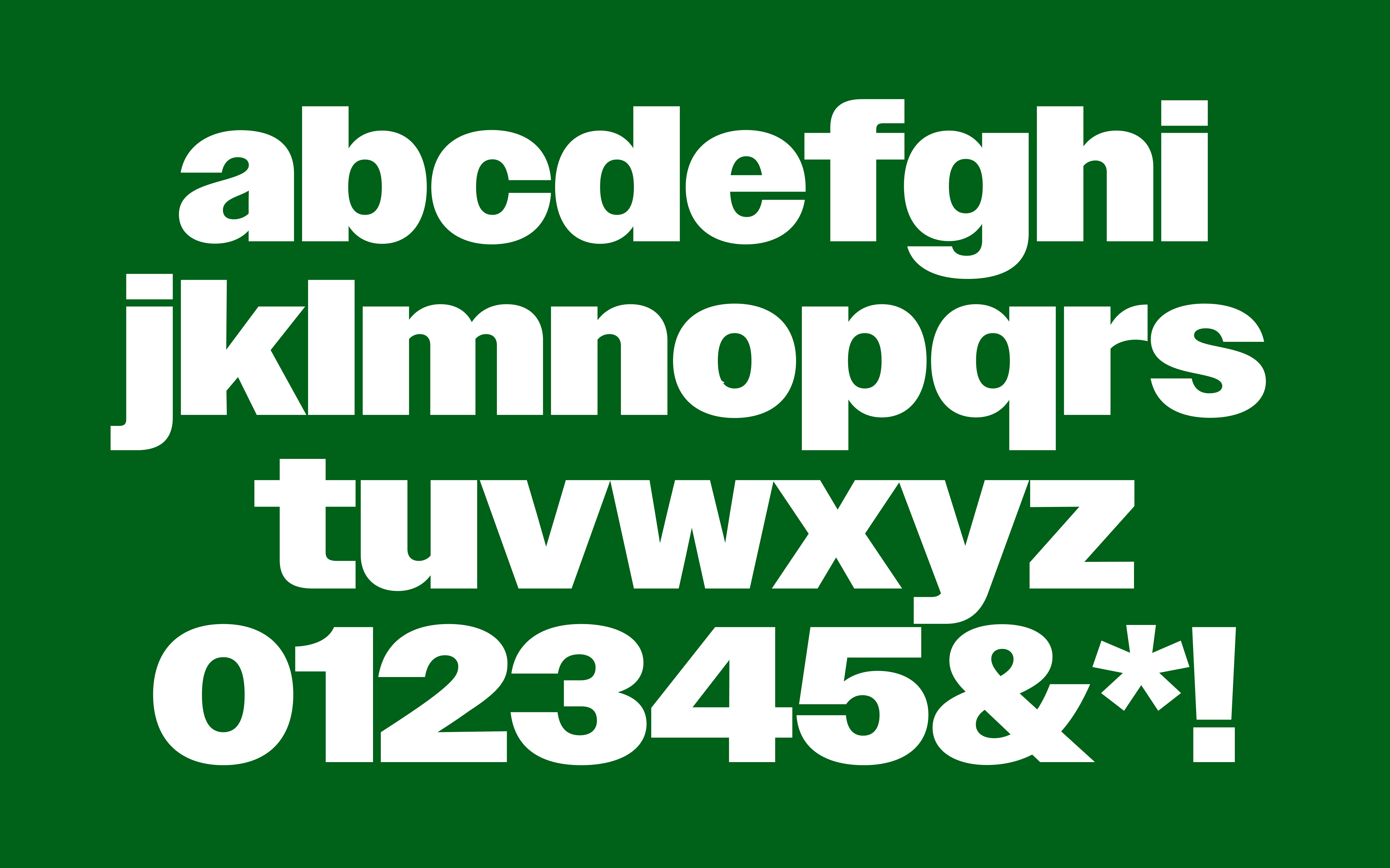
Owners by MCKL
Tags
Brand Audit
Brand Strategy
Visual Identity
Brand System Design
Web Design
Web Development
Illustration
IRL Experiences