Flower Water is a beverage brand reinventing the Swiss staple of Elderflower Water for a new audience.
DECEMBER 2022
BRANDING, PACKAGING, WEB, ILLUSTRATION


Flower Water is a new-to-world beverage brand reintroducing a Swiss classic, Elderflower Water, to a wider audience. With additional botanicals like Rose, Orange Blossom, and Hibiscus, the brand offers a refreshing take on traditional flavors. Flower Water was dreamt up after tennis match on a clay court in the Swiss Alps. With this in mind, we developed an identity that is both elegant and sporty, making it the perfect choice for Après-Ski and Après-Tennis alike.
The identity captures the essence of elegance and refinement while also incorporating an energetic and dynamic spirit. We achieved this balance through the use of a bold sans-serif (Söhne by Klim) alongside a baroque Serif (ABC Synt Italic by Dinamo) forming an pairing that is both stylish and approachable. Furthering this tension, we married the use of traditional gold foil with a bold and striking border system, inspired by the grids of a tennis court. Overall, he identity was heavily influenced by ephemera, taking inspiration from sources as varied as ski patches, lift tickets, national parks and fruit stickers.
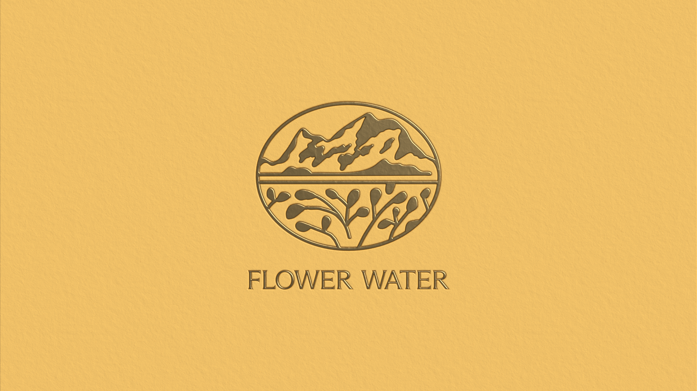
We developed an iconic Wordmark that feels at once timeless and contemporary. This works alongside an illustrative heritage mark, which lives on a separate, gold foiled label along the neck of the bottle following in the footsteps of brands like San Pellegrino and Topo Chico— classics in the water game.
Creative Direction
Briana Garza, Caleb Van Dyke
Renderings/Illustration
Briana Garza
Client
Gabriel Puché, Martin Howell
Typefaces
Söhne Halbfett, ABC Synt Italic
Tags
Branding, Digital, Packaging, Art Direction, Illustration